The Power of Color Theory in Building a Brand That Resonates
Insight
November 6, 2024
When it comes to building a memorable brand, color plays a far more significant role than we might initially realize. Color theory—the study of how colors influence perceptions and behaviors—is a crucial part of visual branding for any industry, including Commercial Real Estate (CRE). The right color palette has the power to evoke emotions, build trust, and communicate your brand’s message before a single word is read. At Brandscape Creative, we carefully selected a palette that reflects our commitment to empowering CRE brands with impactful, professional, and inspiring solutions. Here’s a look into our brand colors and how to choose colors that align with your own brand’s values and goals.
Brandscape Creative’s Color Palette
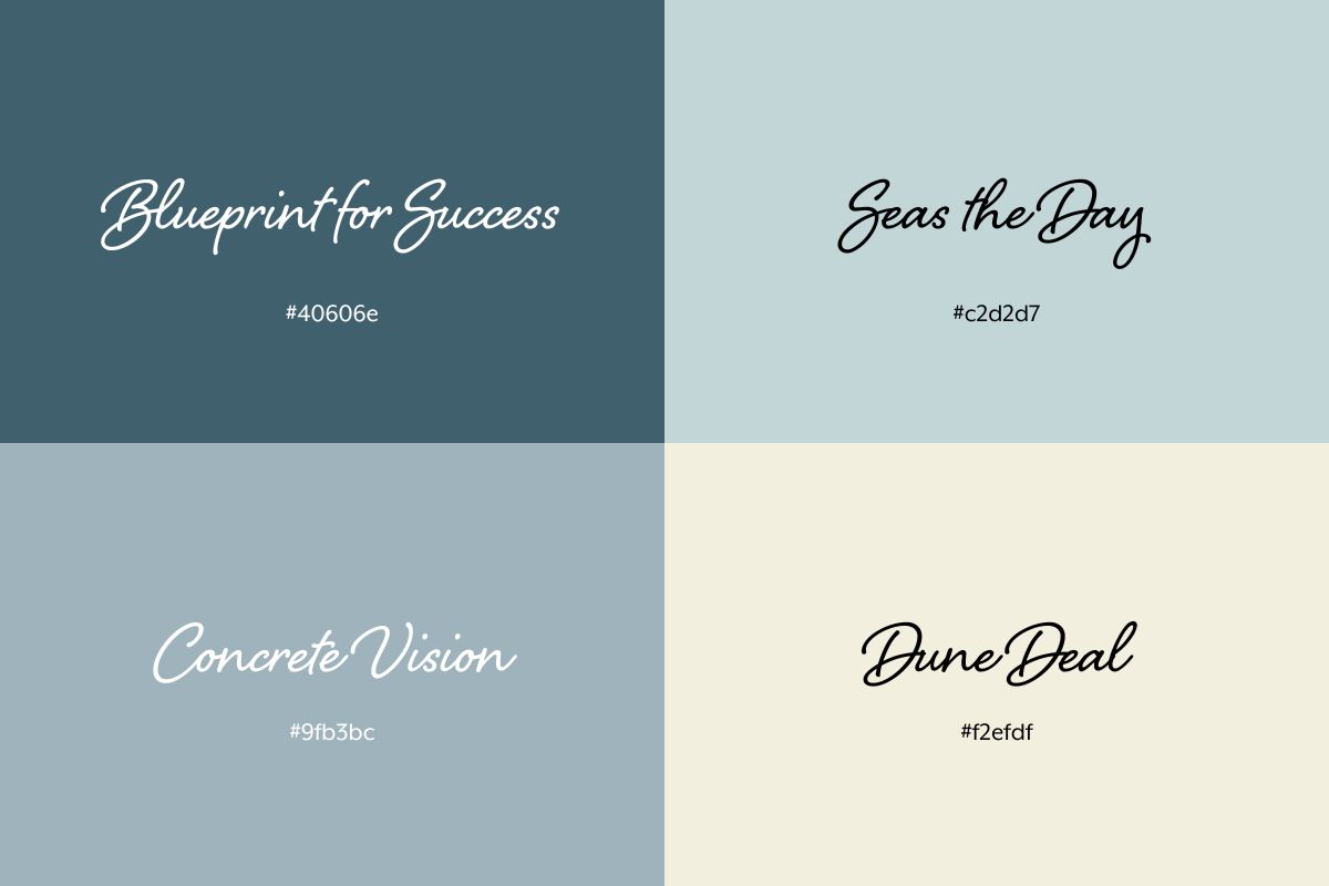
Our color choices were made with both our brand personality and our clients’ needs in mind. Here’s a breakdown of each color and the reasoning behind it:
- Blueprint for Success: This strong, deep blue symbolizes structure, strategy, and reliability. In branding, blues often convey trustworthiness and professionalism. Much like a blueprint, this color reflects the detailed, foundational work that goes into creating brands that resonate and endure in the CRE market.
- Concrete Vision: A grounded, steadfast blue-grey, “Concrete Vision” reflects the stability and clarity we bring to every project. Just like concrete forms the base of a building, this color communicates our dedication to establishing durable and impactful brand foundations for our clients.
- Seas the Day: This vibrant, uplifting blue-green represents seizing opportunity and moving forward. Blue-green tones evoke energy and approachability, perfect for reflecting Brandscape Creative’s proactive approach to helping clients navigate their branding journeys.
- Dune Deal: A warm, sandy neutral, this color recalls coastal landscapes and reinforces the notion of reliability and a job well done. This shade embodies the grounded, dependable solutions we provide to our clients.
Each of these colors was selected not only to represent Brandscape Creative but also to resonate with our audience in the Commercial Real Estate field, helping them feel both inspired and confident in our services.

The Role of Color Theory in Branding
Color theory is foundational to effective branding. Colors influence perceptions, evoke specific emotions, and even drive actions. For example:
- Blue is often associated with trust, stability, and dependability, which is why so many financial and technology brands (like LinkedIn, JPMorgan, and American Express) use blue. For CRE brands, blue can help convey credibility and expertise, essential qualities when managing high-value properties or investments.
- Green suggests growth, sustainability, and freshness. While green is common in eco-friendly brands, its use in real estate or finance can symbolize financial growth and development. The calming effect of green, seen in brands like Fidelity, makes it a strong choice for brands focused on building lasting, trustworthy relationships.
- Grey and Neutral Tones communicate professionalism and a modern edge. Often used by luxury brands or companies in industries that prioritize sophistication (such as architecture and design), neutral tones suggest stability and refinement, making them ideal for brands that want to convey a high-end feel.
- Earthy Tones (like tan, beige, and muted browns) bring warmth and approachability. Brands in real estate and home development often use these colors to create a welcoming feel. Earthy tones appeal to audiences looking for reassurance, as they evoke the reliability and warmth of home.
By thoughtfully applying color theory, companies can create a visual identity that reinforces their brand values and message. Colors should not only be aesthetically pleasing but also work as psychological cues to communicate the essence of your brand to your audience.
Choosing Colors for Your Brand
When choosing a color palette for your personal or company brand, consider what you want your colors to communicate to your audience. Here are some steps to help guide your choice:
- Identify Your Brand Values: What qualities do you want your brand to communicate? If your brand stands for stability and expertise, shades of blue or grey may work well. If you’re focused on innovation, consider brighter, more dynamic colors.
- Research Color Associations: Color meanings can vary by industry and culture, so it’s important to choose colors that align with the expectations and preferences of your target audience. For instance, a CRE firm might benefit from blues or greys to convey professionalism, whereas a property management company may choose greens or earthy tones for a more approachable, community-focused feel.
- Use Color Psychology to Evoke Emotions: Decide how you want people to feel when they interact with your brand. Blue, as mentioned, builds trust, while green suggests growth. Yellow can add energy, while neutral tones can provide a calming balance.
- Test the Colors: Once you have a few options, try them in various settings, such as digital and print, to see how they work in different environments. Ensure the colors feel cohesive and maintain their impact across platforms.
A well-chosen color palette is an investment in your brand’s future, helping it connect with audiences on a deeper, more emotional level. At Brandscape Creative, we understand that colors are more than just design choices—they’re part of the story we tell on behalf of our clients. Whether you’re creating your own brand or refreshing an existing one, the colors you choose should speak to your values, your audience, and your long-term vision.
Ready to dive into color theory and build a brand that truly resonates? Let’s chat about how Brandscape Creative can help bring your brand vision to life with strategic colors that reflect who you are and where you’re going.


